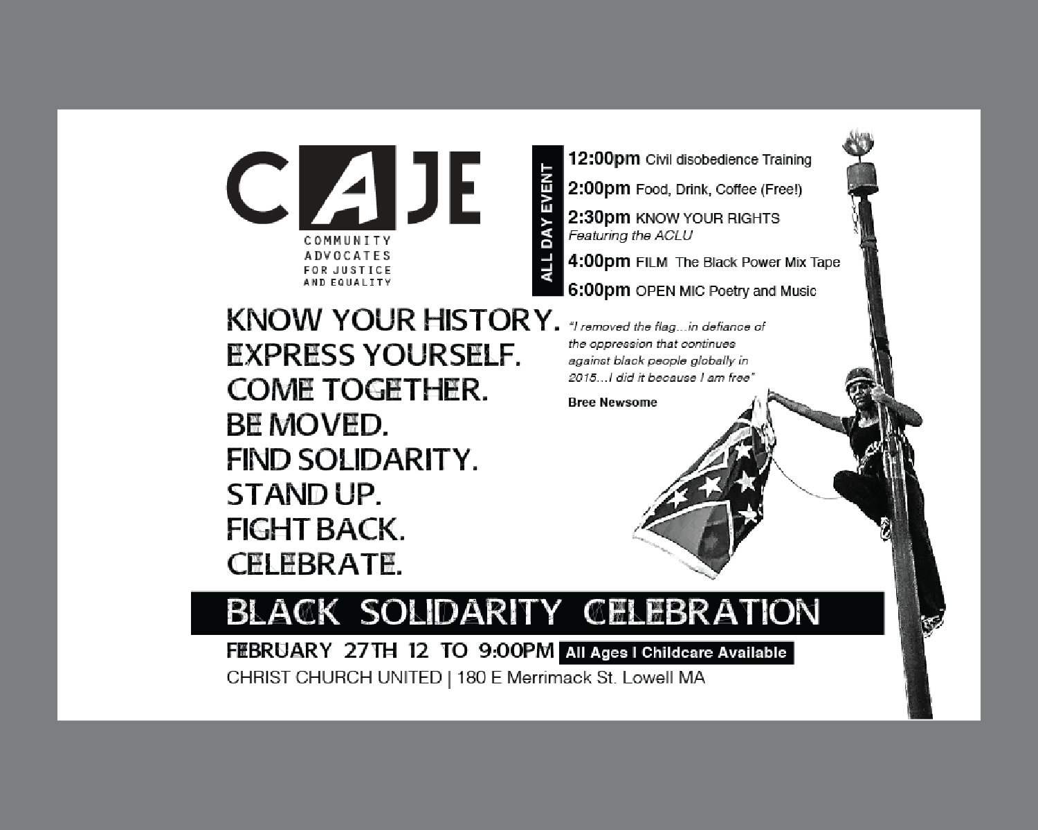
Community Advocates for Justice and Equality
2018
Branding, identity, illustration, design
“A multiracial network of community members and organizations; We empower, raise awareness, provide resources and advocate for the marginalized.”
CAJE was operating without a clearly identifying brand. The primary objective in this project was to create a strong logo expressing the core values of the group while also identifying with the City of Lowell.
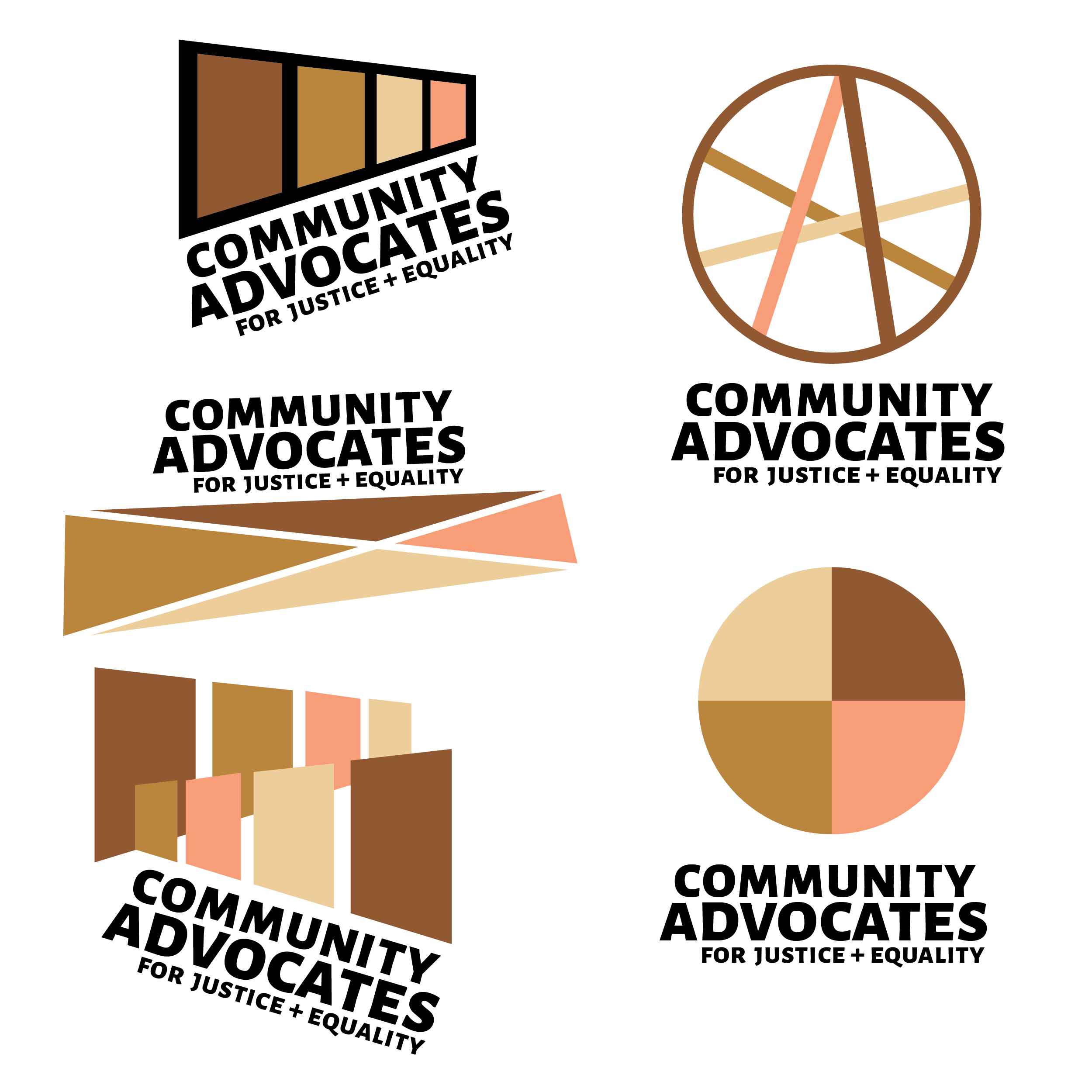
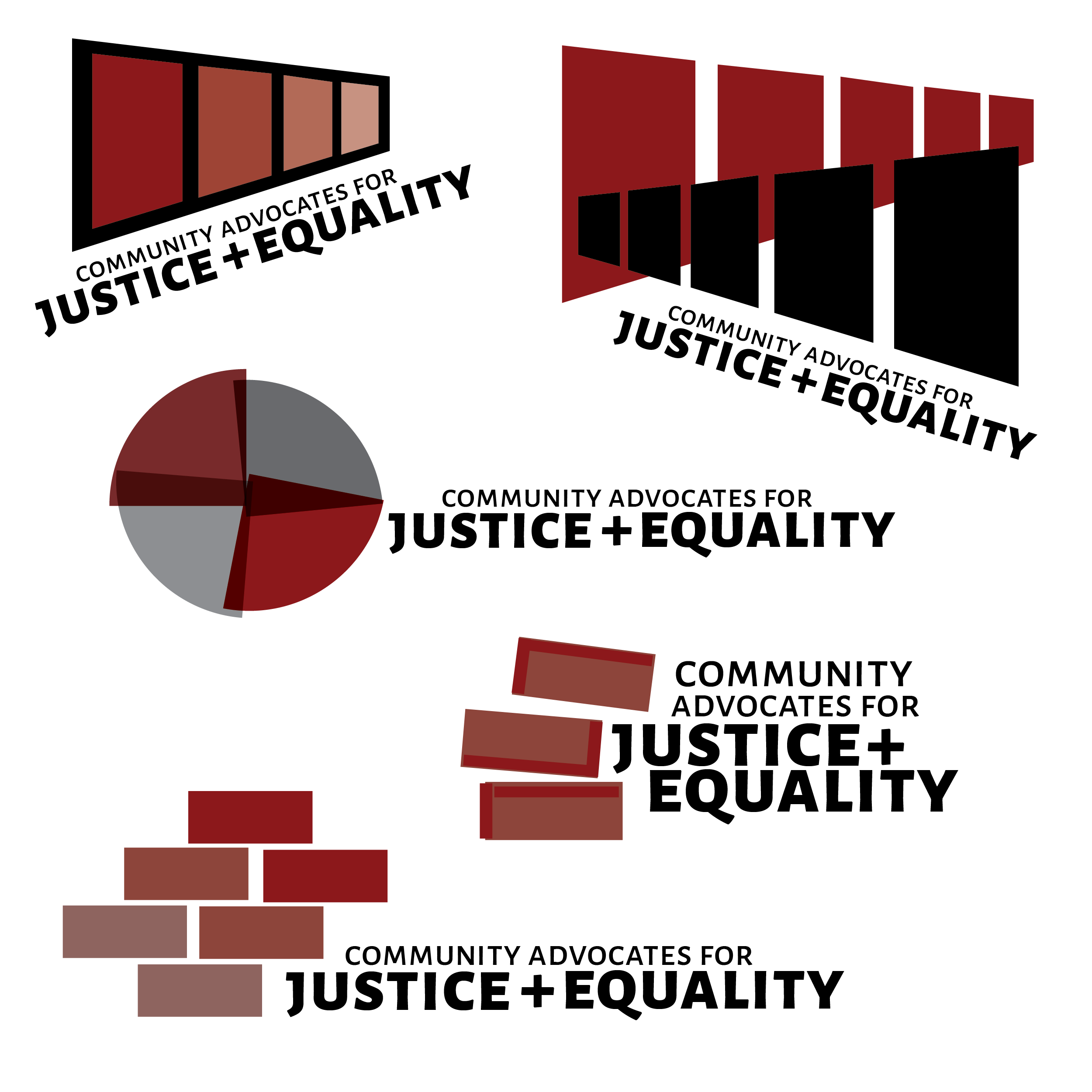
“Too many cooks” is one danger of designing for a loosely structured organization. The process of developing a logo took three sets of logo iterations. The final design phase involved getting several members of the group in the same room. During this time, I worked and we critiqued the design for several hours until we had a solution.
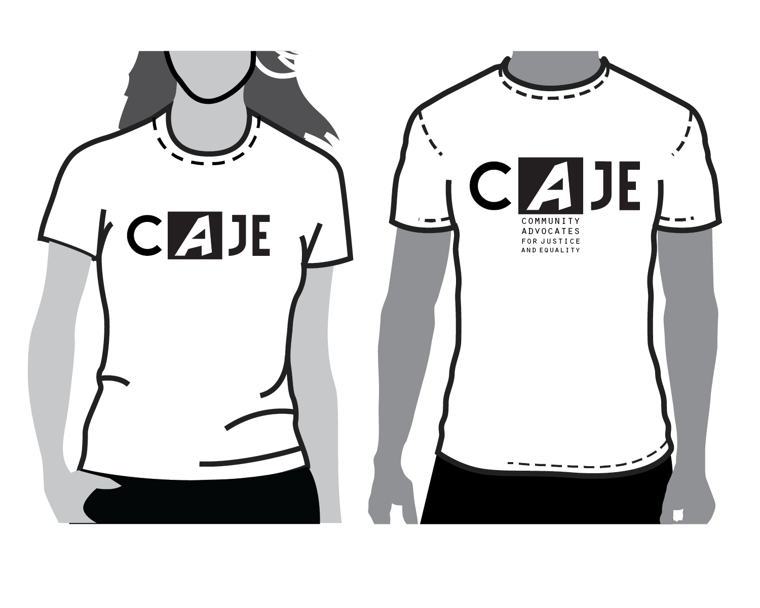
Below you can see mock-ups of them in hypothetical use. Further, I've included many of the other numerous early iterations of the logo.
